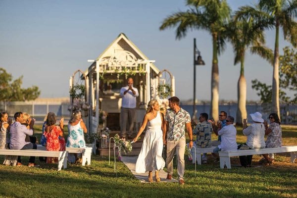
David Tutera, star of WEtv’s “My Fair Wedding,” shares his favorite wedding palettes.
By: David TuteraChoosing a color scheme isn’t just about picking a color; it’s about setting a style. Where does color first get infused? It starts out with color in the invitations, the color of the bridesmaid dresses, the embellishments for the groomsmen, the tablecloths, the flowers, the cake and, ultimately, the lighting. What does color do? It sets a tone, a mood and an energy.
I’ve always said you should not go beyond three colors: any more than that can result in a look that’s a little too juvenile or circuslike. So either pick three different colors or variations of one overall color — if the latter is the case, you can have more than three shades (e.g. five or seven shades of blue).
Here are some of my favorite color palettes:
Blue
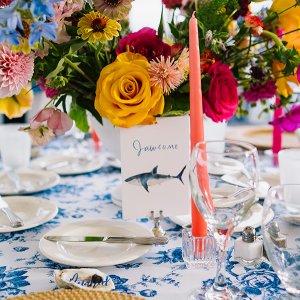
Everyone knows my favorite color is blue. It’s the color of my brand, it’s soothing, calming and it of course fits in with “something blue” which should definitely be in your wedding. Think about infusing blue with multiple shades of this hue, along with white and silver or pewter (but not both).
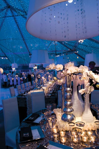
Photo Credit: Maring Visuals
Get more ideas for a blue wedding color palette ►
Red, Orange, and Pink
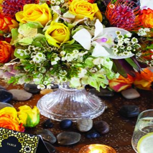
Another color scheme you could go with is a combination of fire engine red, Hermés orange and really bright fuchsia. These are the perfect colors for a bright, fun party, and set the tone for that festive feeling.

Photo Credit: Stevie Ramos Photography
Get more ideas for a red wedding color palette ►
Neutrals
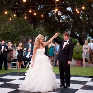
Considering a classic approach? Classic to me is whites with ivory and a touch of pewter or silver — super refined and very traditional.

Photo Credit: Ashfall Mixed Media, Inc.
Old-World Baroque
Include tones of gold, copper and ivory. If you want to be daring, you can some deep jewel tones, which would be either (not both) a deep burgundy or a deep midnight blue.
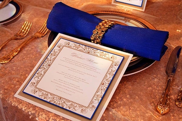
Photo courtesy of Cherish Paperie
Get more ideas for a gold wedding color palette ►
Diamond White
A modern color scheme is pure diamond white across the board — literally just one color. If you wish, sprinkle in some accent colors, which could be metallic (no gold) and one strong color (e.g. purple, red, cobalt blue) — or simply a solid white paired with a metallic.
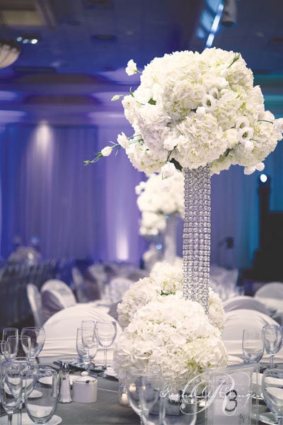
Photo Credit: Xero Digital Photography/Created by: Rachel Clingen
Whimsical
This color scheme works well with pastels, and is an opportunity to go with multiple shades of one hue (e.g. lavenders, traditional purples and lilac shades). Or, you can do something like soft peach, petal pink and buttercup yellow — which will also convey a beautiful whimsical look. You can also consider a Midsummer’s Night Dream palette, which is achieved with forest-y shades of green (but not bright kelly or lime green) — think deep greens like grass green and moss green, accented with khaki and ivory.

Photo Credit: Becca Rillo Photography
Purple
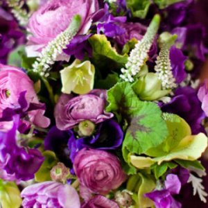
My favorite color trend for 2013-2014 is purples and lavenders. You can go from as deep as a quartz purple, which is a very deep, regal purple, to a traditional purple and a third tone of lavender or lilac. If you wanted to add an accent color, make it silver — I do not like gold paired with purples. Silver is a more classic, elegant choice.
Photo Credit: Tonya Malay Photography
Get more ideas for a purple wedding color palette ►
A good rule of thumb: Don't overdo it. Stick with a variation of one hue or no more than three different colors. You don’t want to overwhelm yourself or your guests with too much color — leave some room to breathe — and dream. Now, exhale slowly — and get started. wedding.
Plus: Get hundreds of ideas for every color of the rainbow ►

